The Mainline Hotel sits directly in the heart of life in the loud, busy core of downtown Toronto — literally and figuratively — and helps guests live like a local by connecting them directly to events, experiences, and most importantly, the people that make this city such a treasure.
The Challenge: create a brand identity for a new hotel taking up residence in a historic building in downtown Toronto.
The Q: how can we create a robust brand identity for a new hotel that caters to people looking to truly experience Toronto as a local by connecting them directly to the events, experiences and people that make the city what it is?
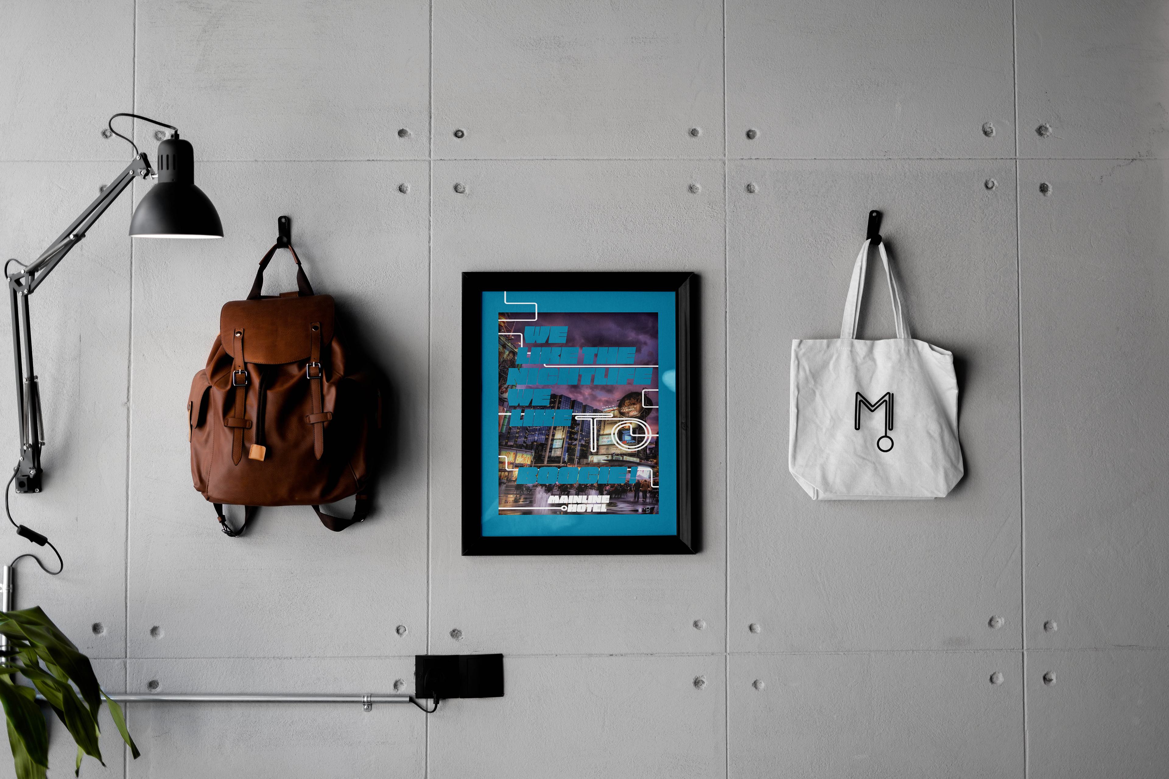
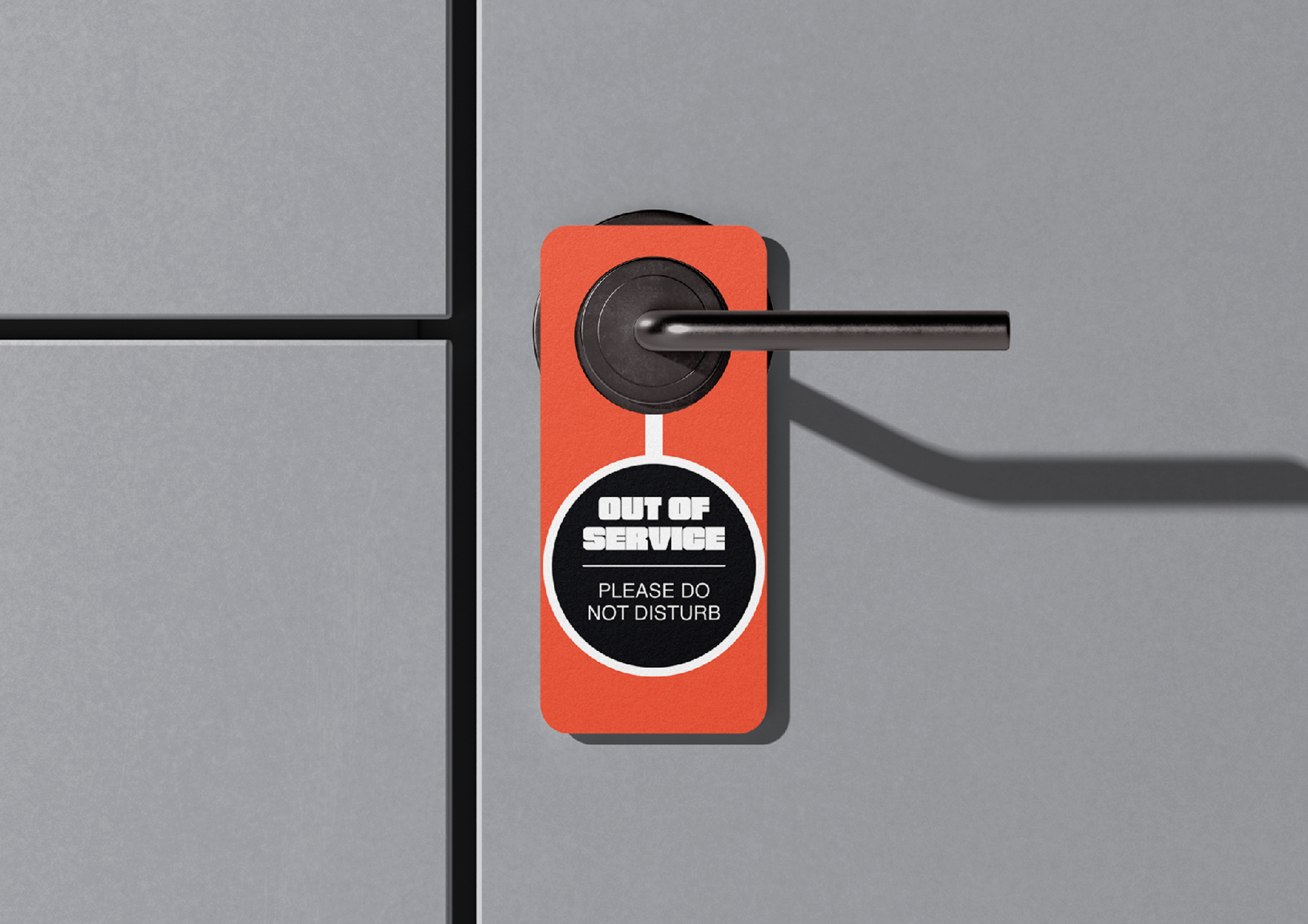
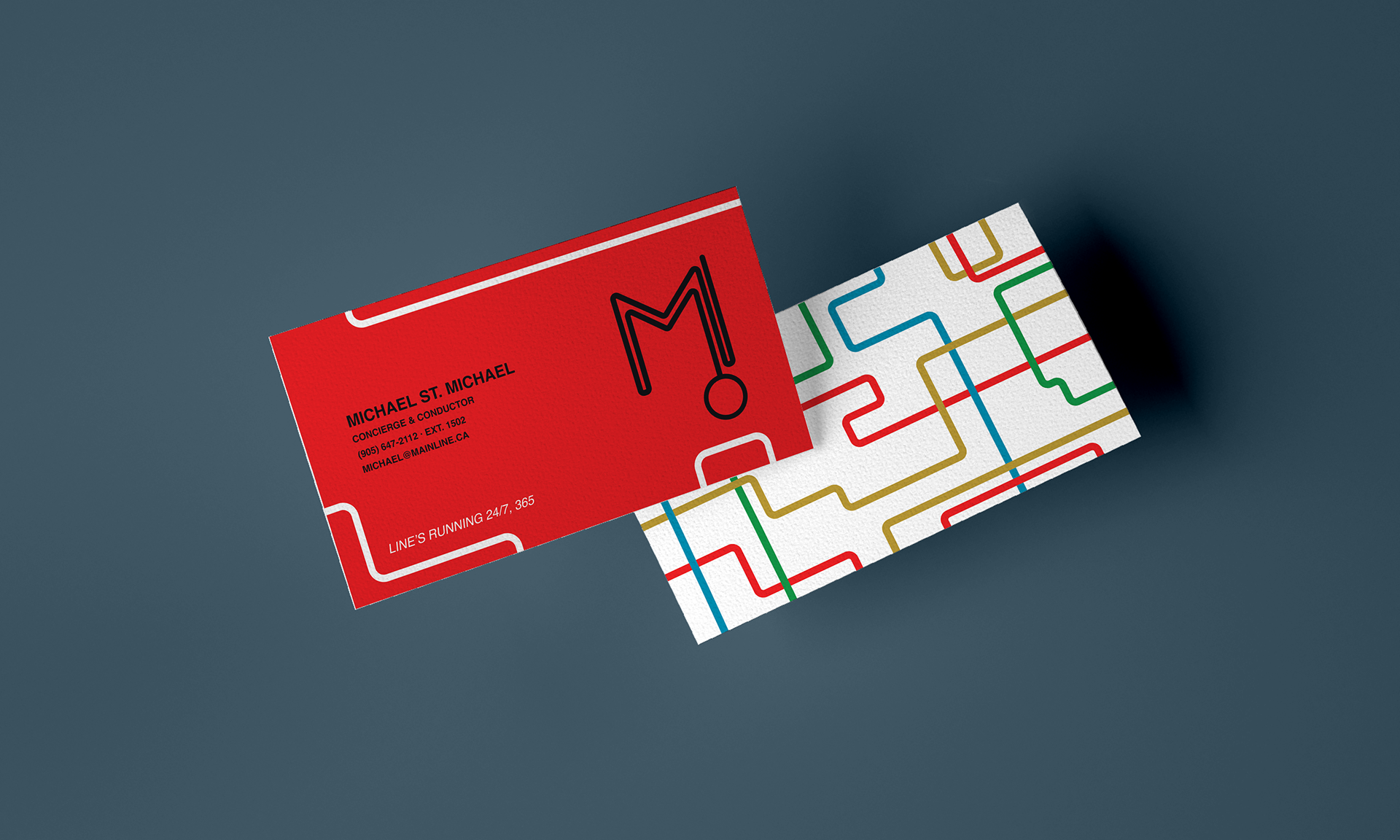
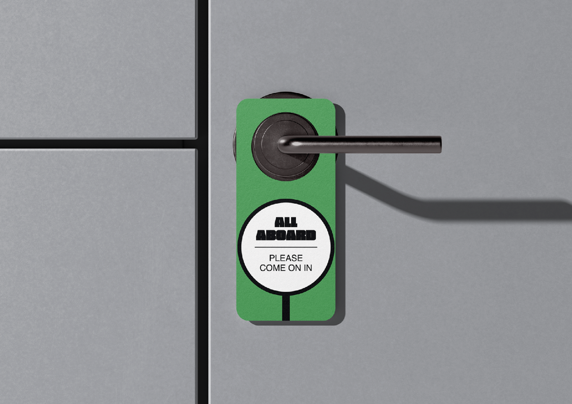
The A: inspired by the connectivity of the subway system, the Mainline Hotel uses every opportunity to create a feeling of connection between its guests and the city. Boldness is the throughline for the brand, colour palette, logo, and main lockup. The tone of voice reinforces that boldness, while the graphic use of intersecting lines plays to the core idea that nothing is beyond reach for guests at the Mainline Hotel.
Skills: ideation, mood boarding, brand development, brand application, logo design, typography, layout, packaging design, copywriting and tone-of-voice, InDesign, Photoshop, and Illustrator
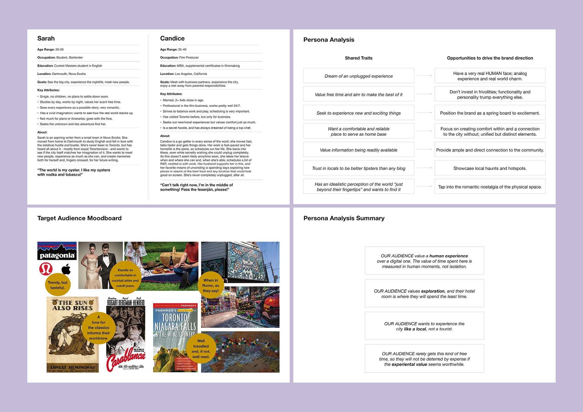
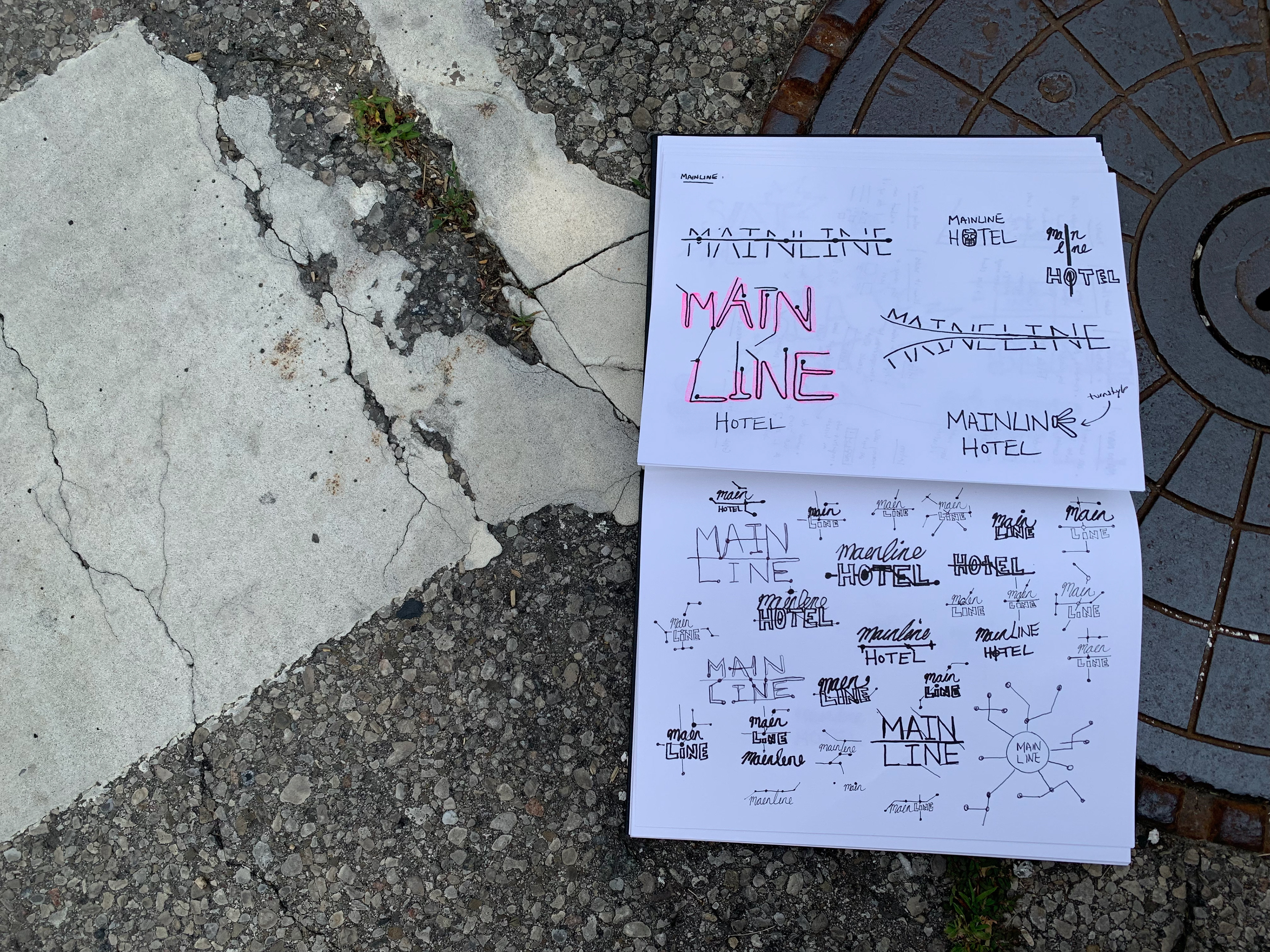
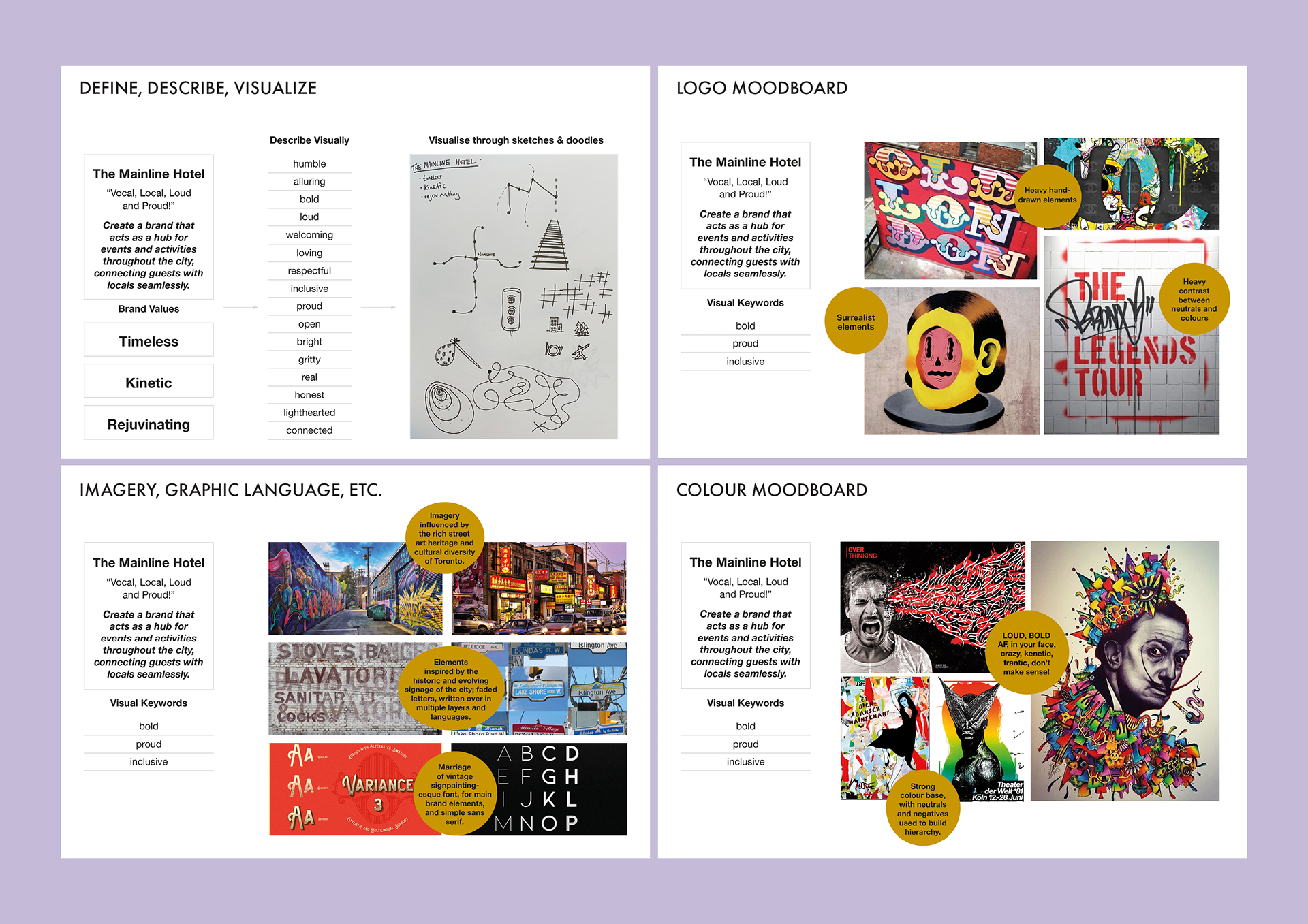
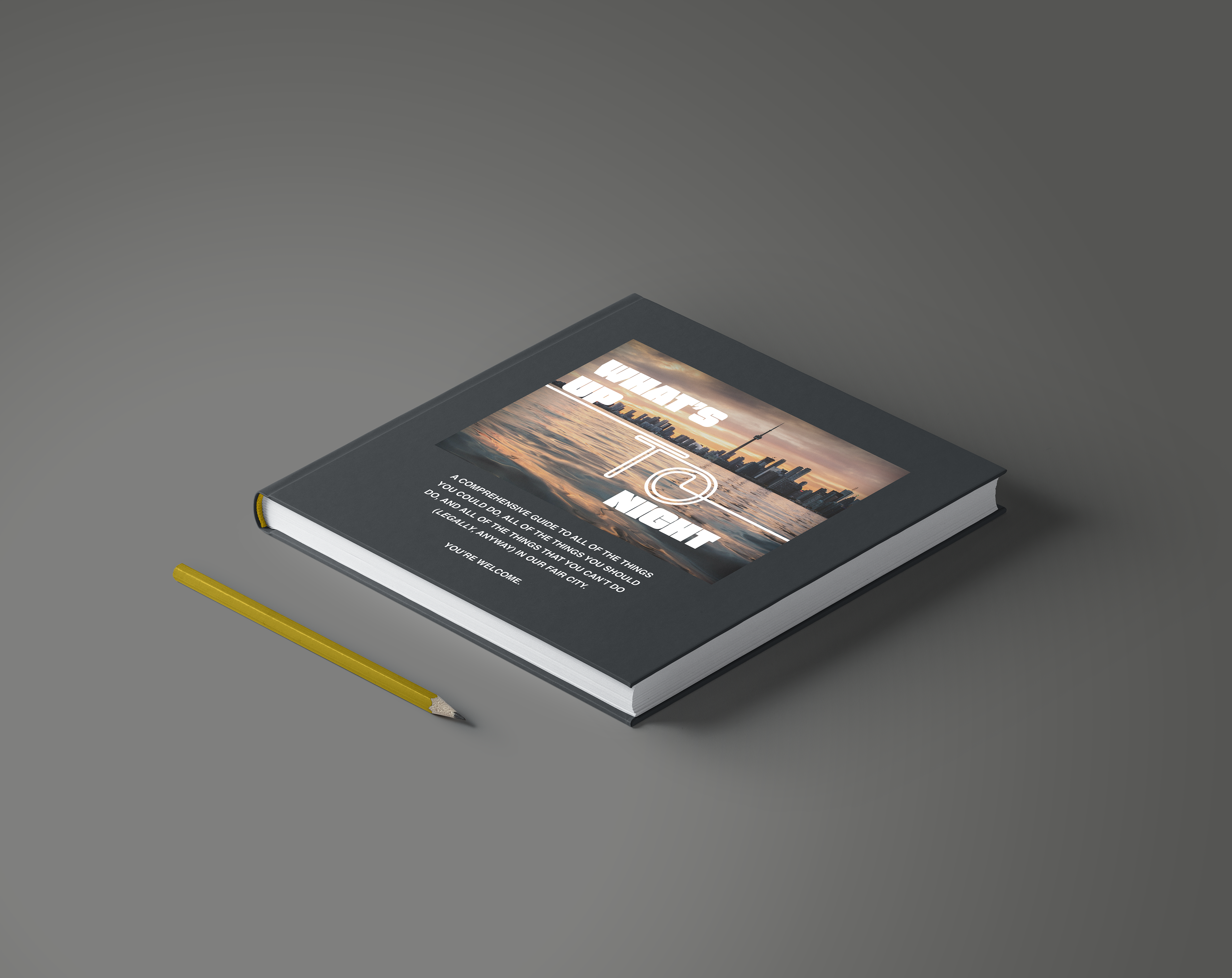



*this work was produced as a student project for the Shillington School of Graphic Design.