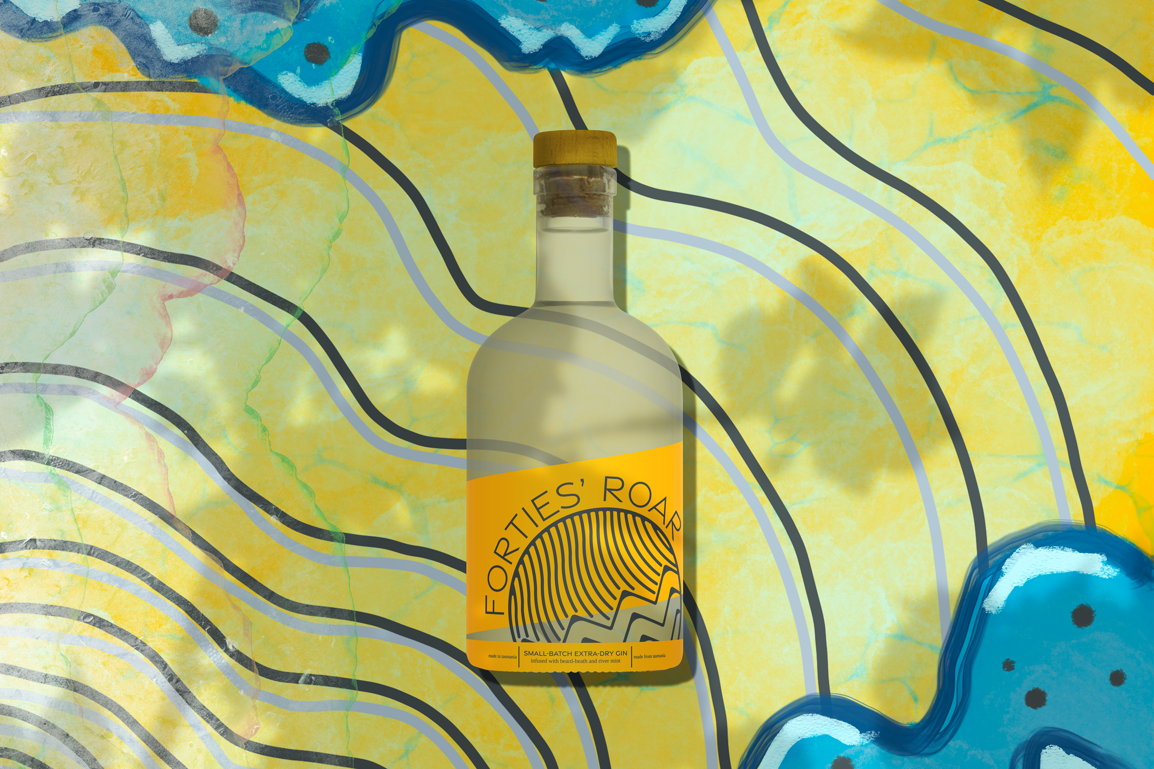
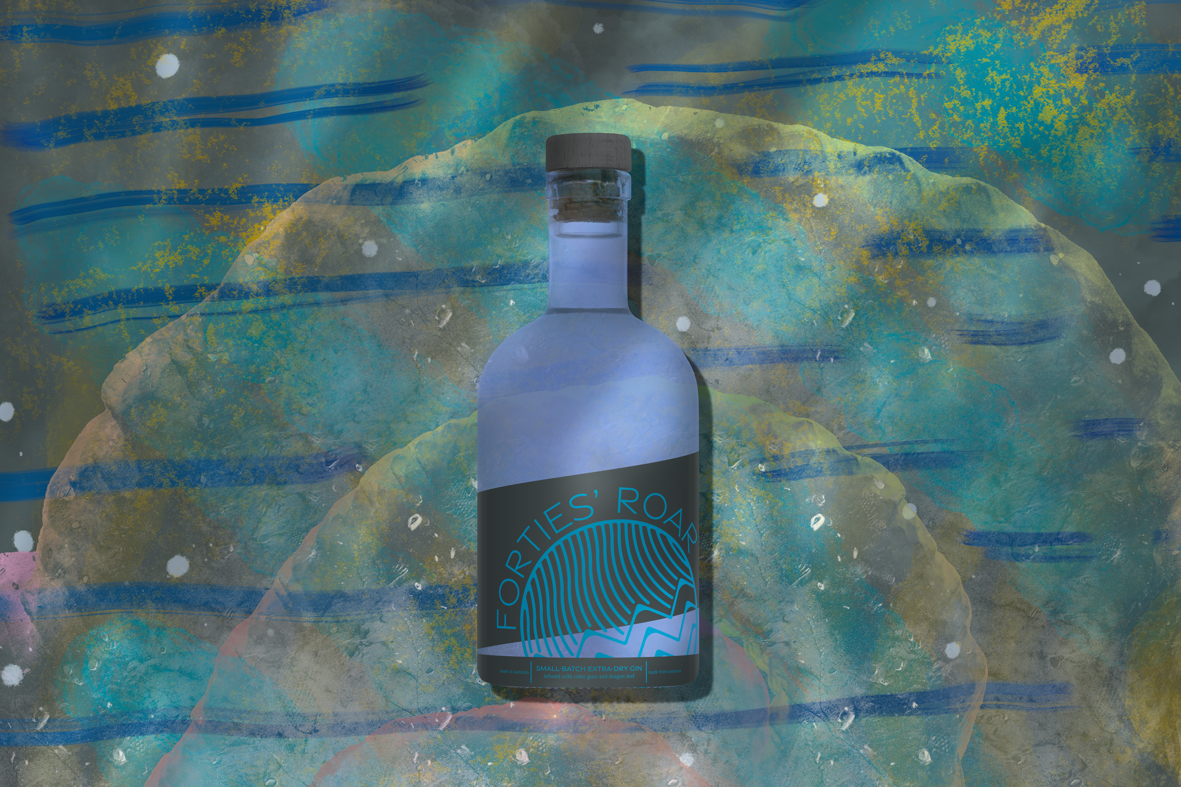
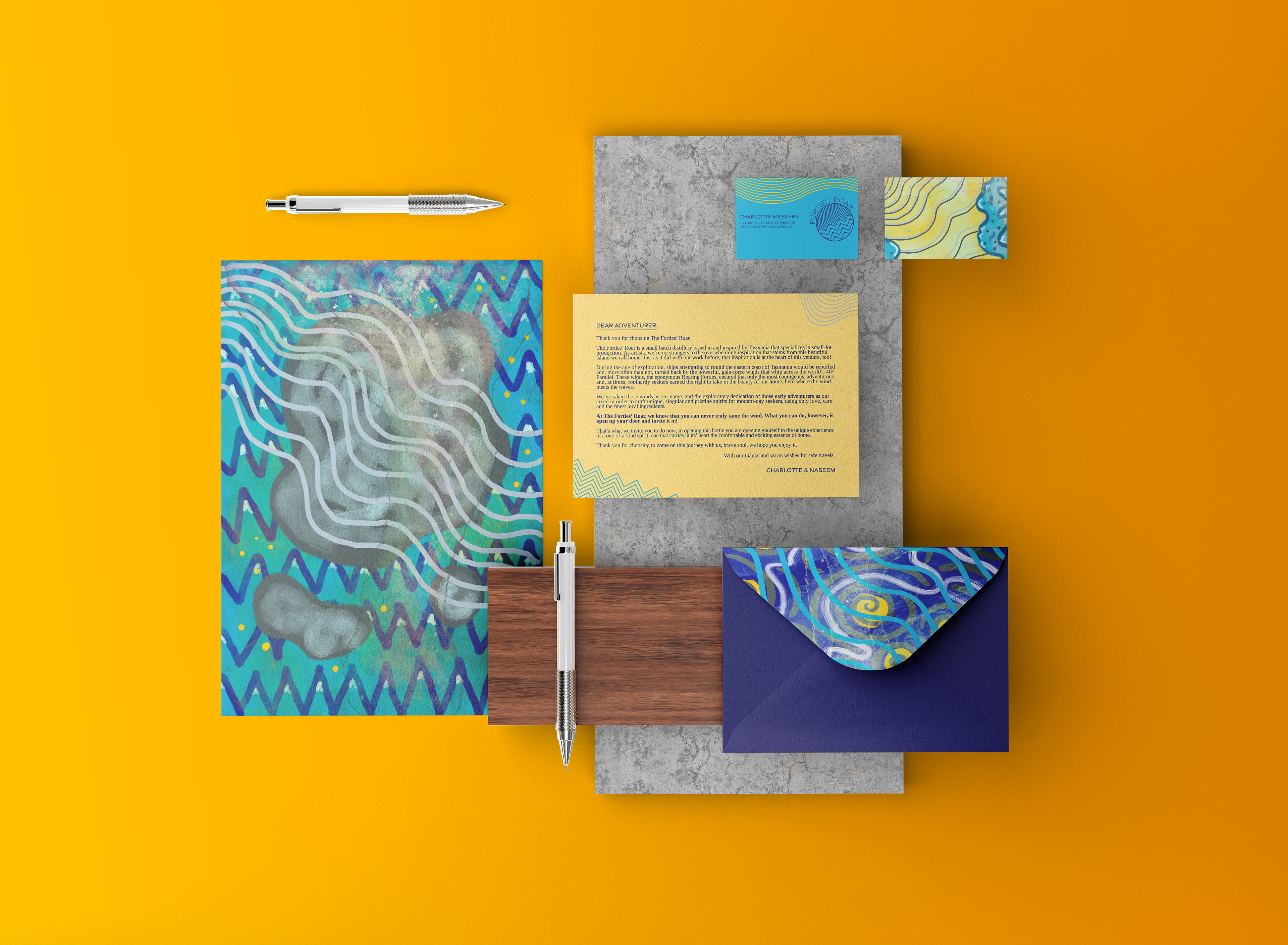
Forties’ Roar is a small-batch gin distillery in Tasmania founded by two local artists who found such joy in distilling gin on their back porch that they decided to brand it and share their creations with the world.
The Challenge: ideate and design a brand identity for a small-batch distillery in Tasmania.
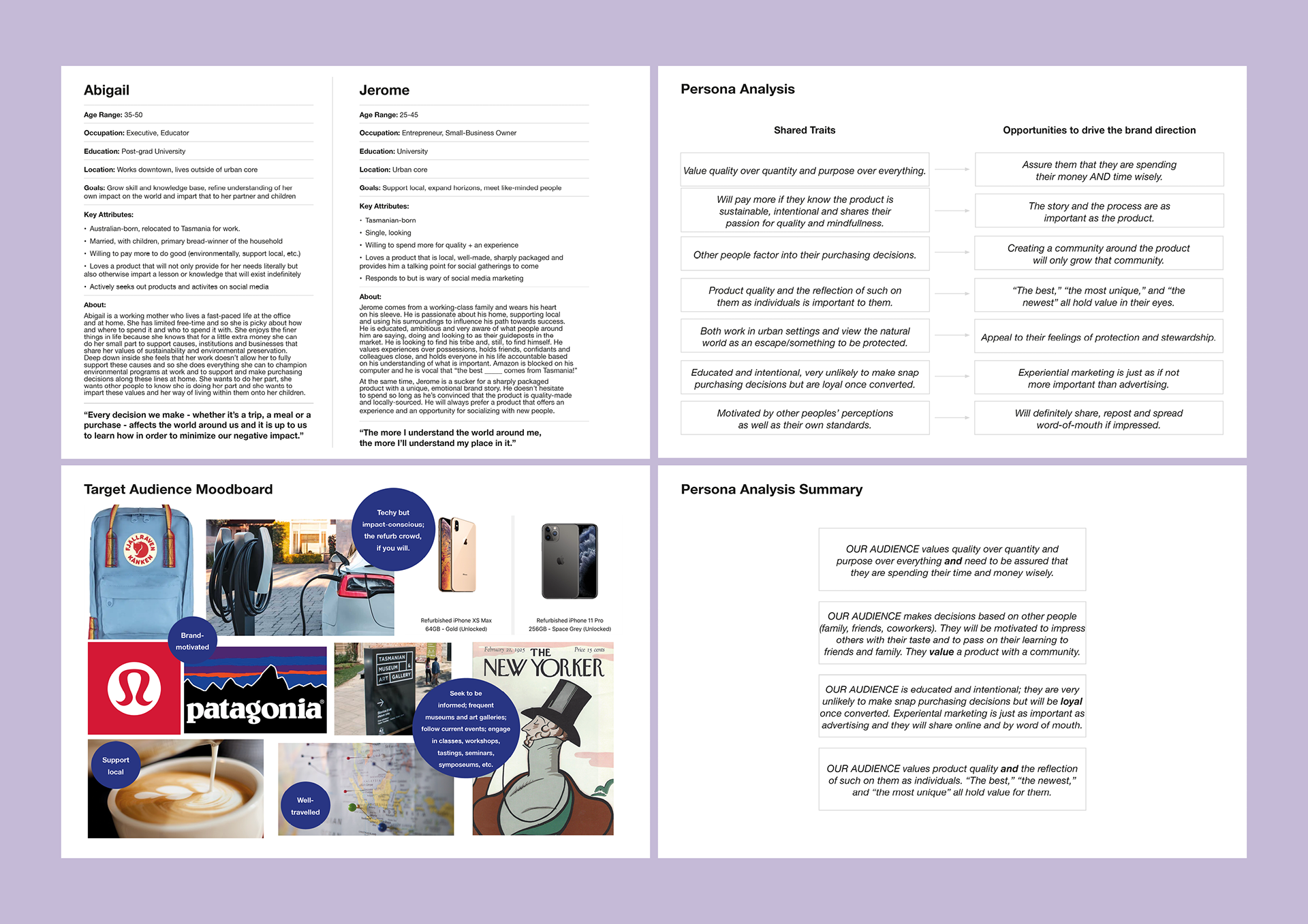
The Q: how can we create a brand identity that embodies its founders' values and honours its place of origin in order to attract an engaged audience eager for new experiences?
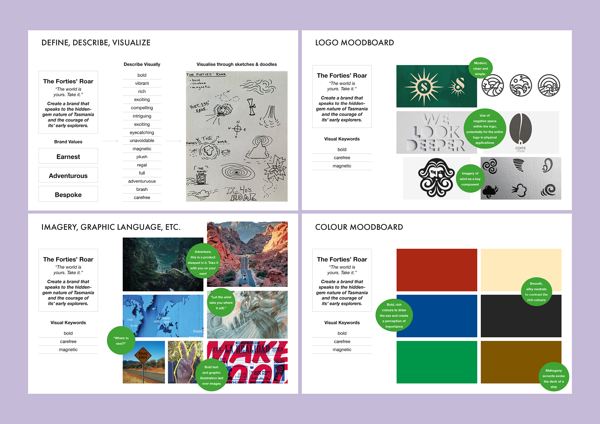
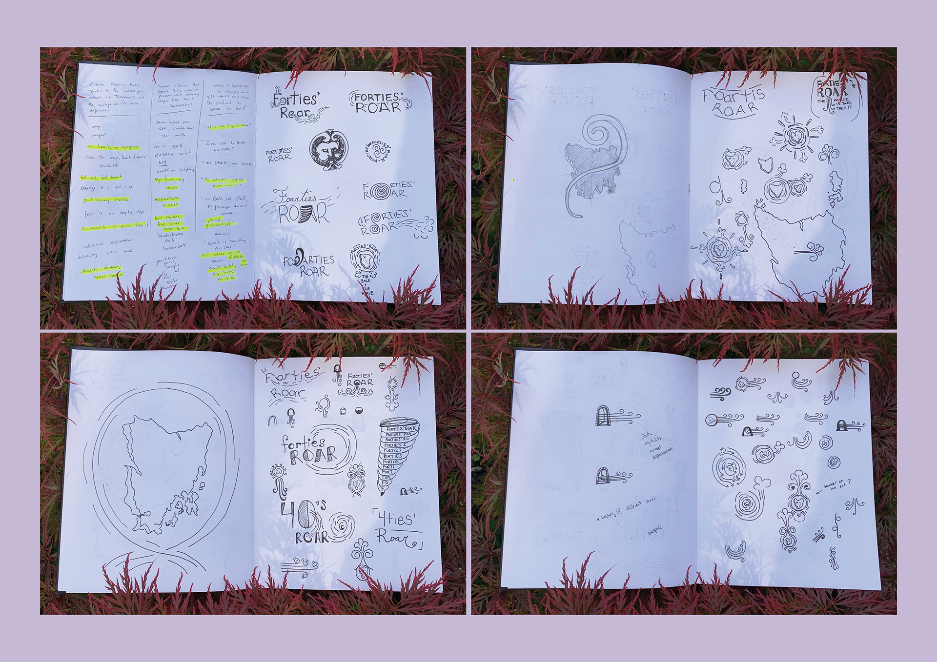
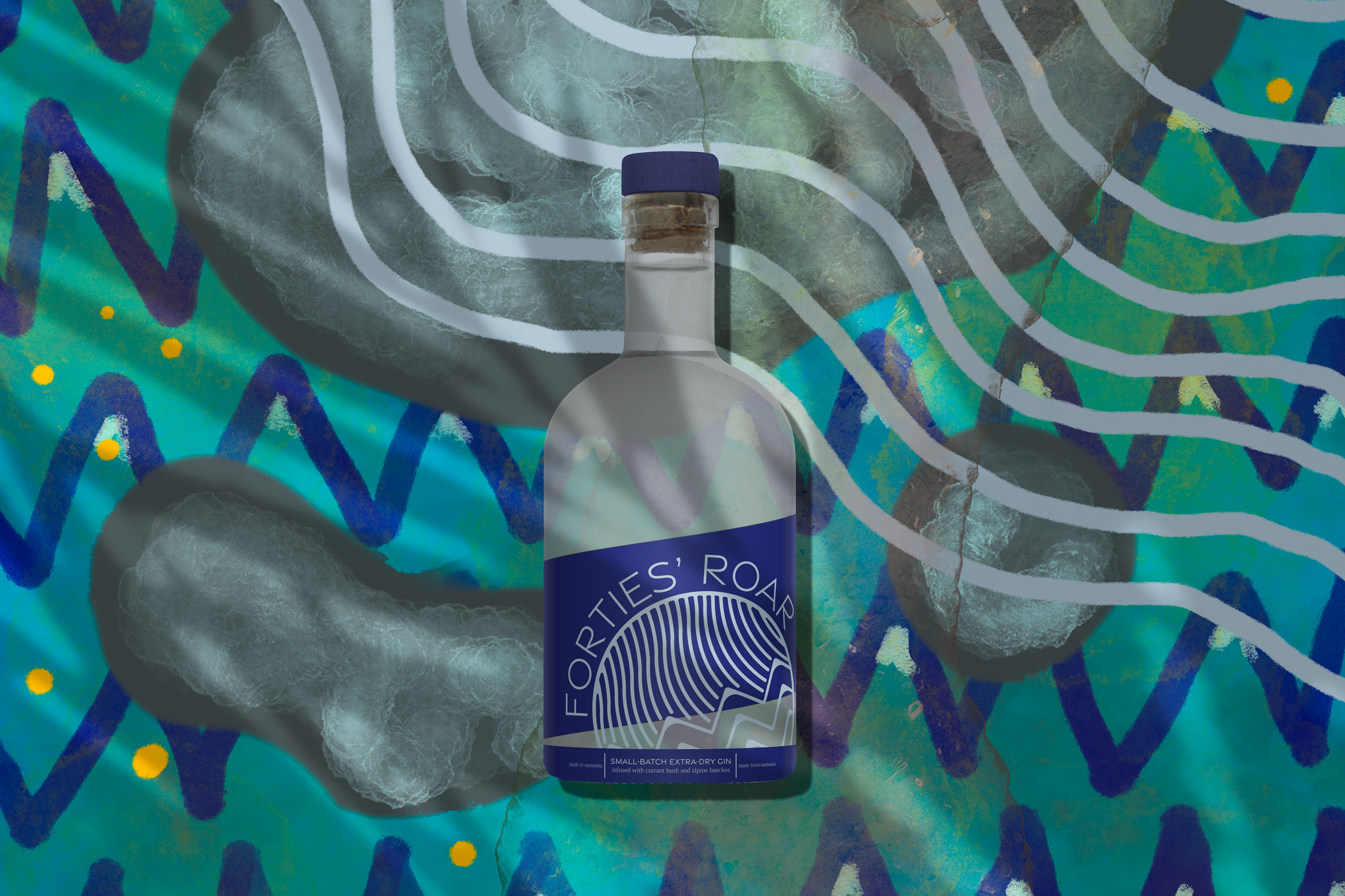
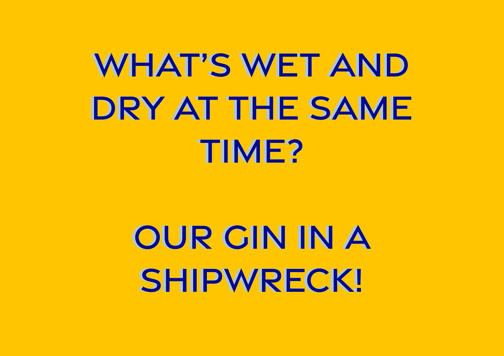
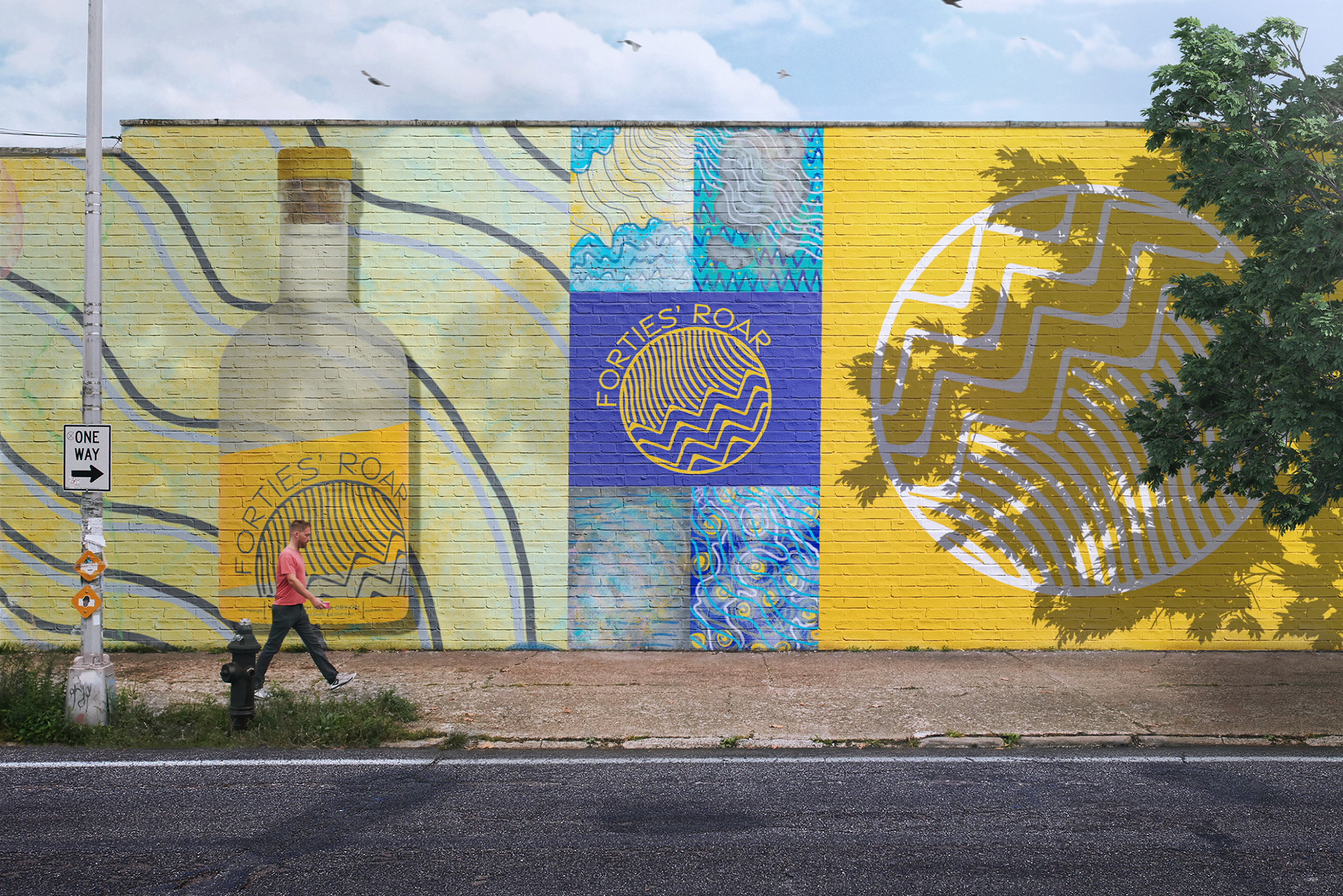
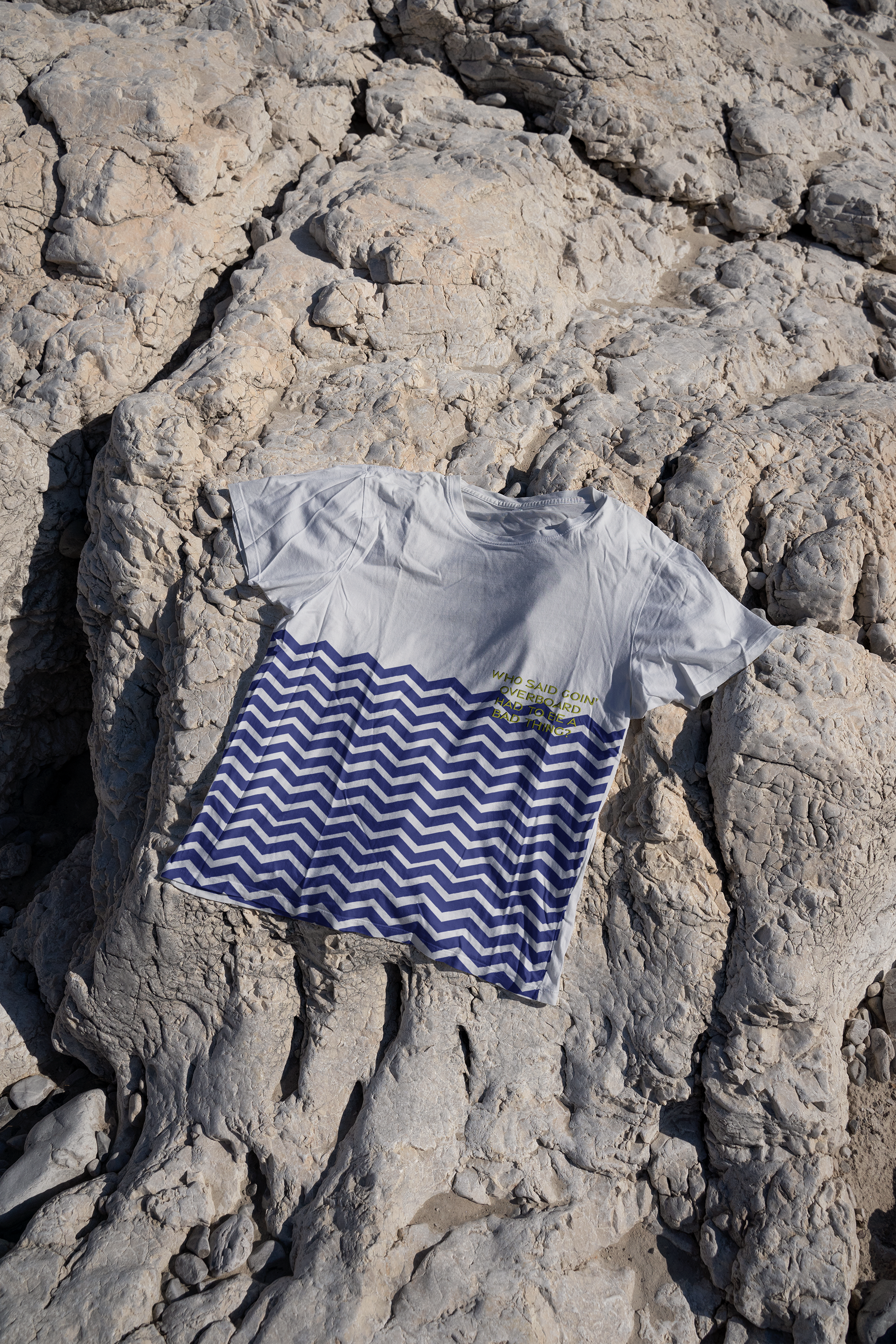
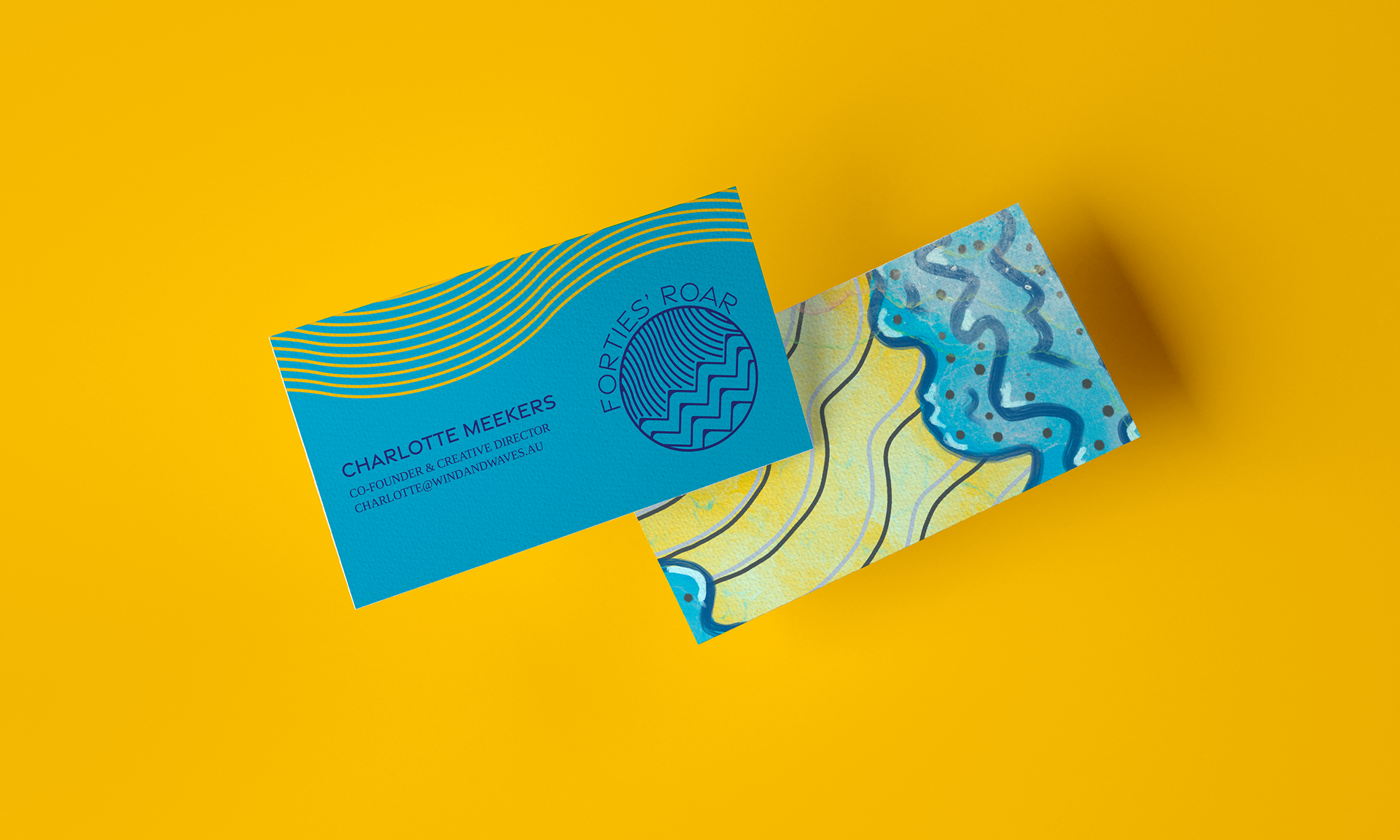
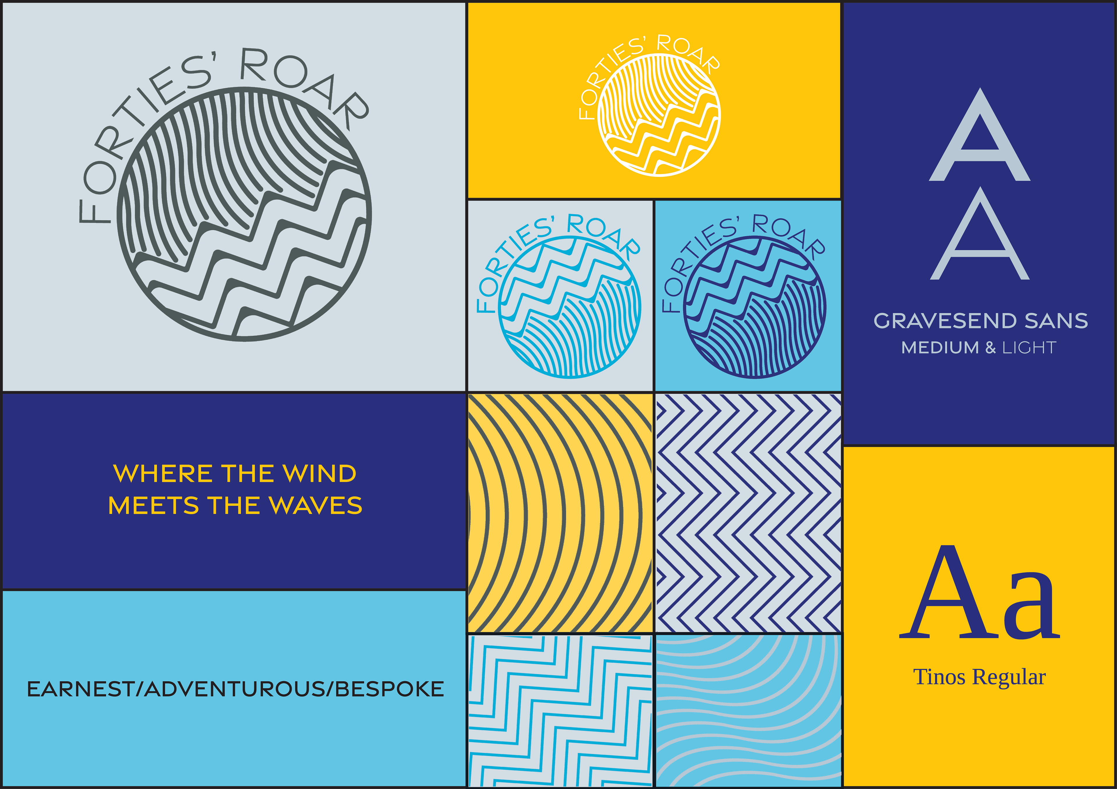
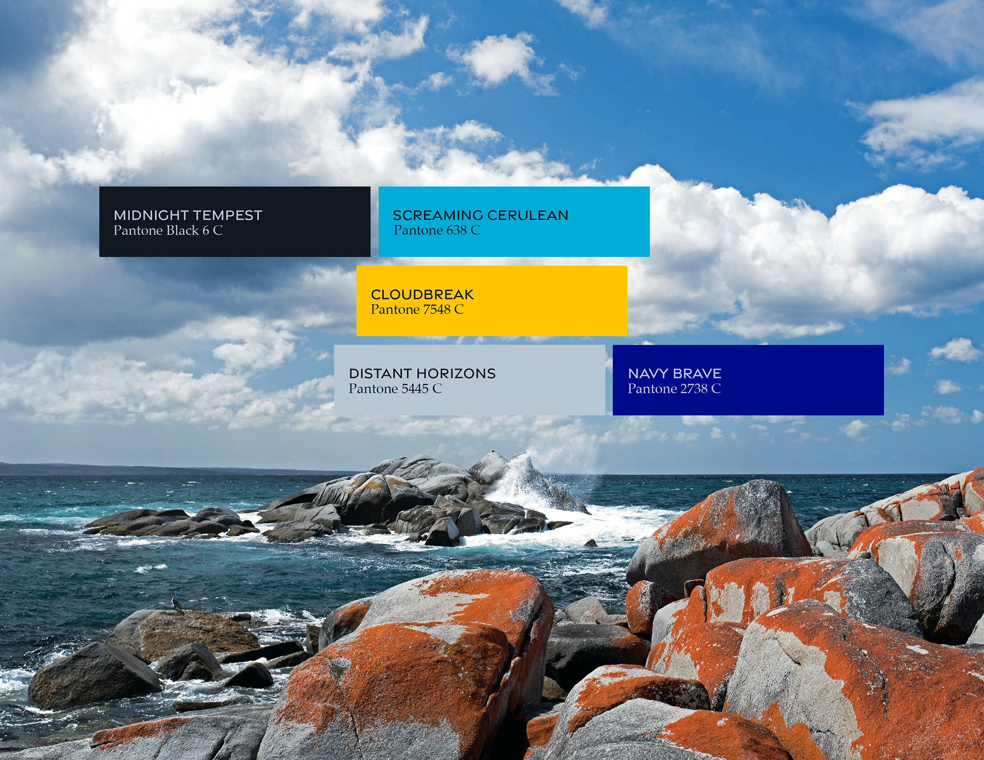
The A: Forties’ Roar combines a name that is deeply rooted in Tasmanian history and geography with colours and a graphic language pulled from the sea and sky. By embracing the natural world and Tasmania’s unique place in it, we forge a brand identity that is both powerfully local and universally understood.
Skills: ideation, mood boarding, colour theory, research, typography, typesetting, copywriting, brand development, brand application, logo design, print design, package design, inDesign, Photoshop, Illustrator

*this work was produced as a student project for the Shillington School of Graphic Design.