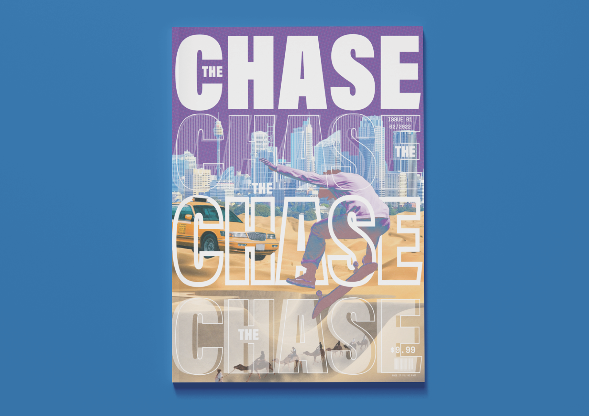
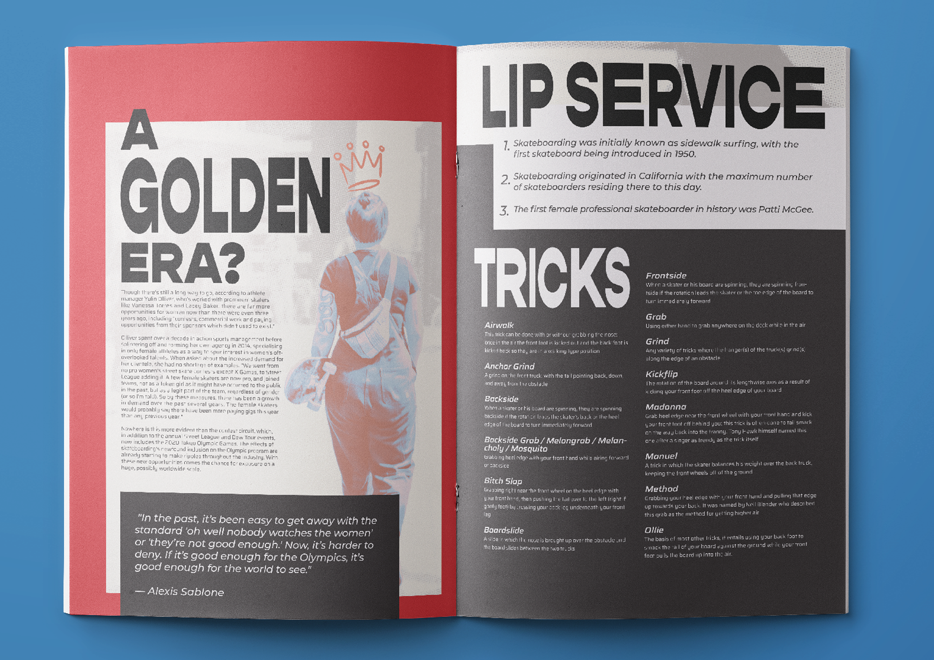
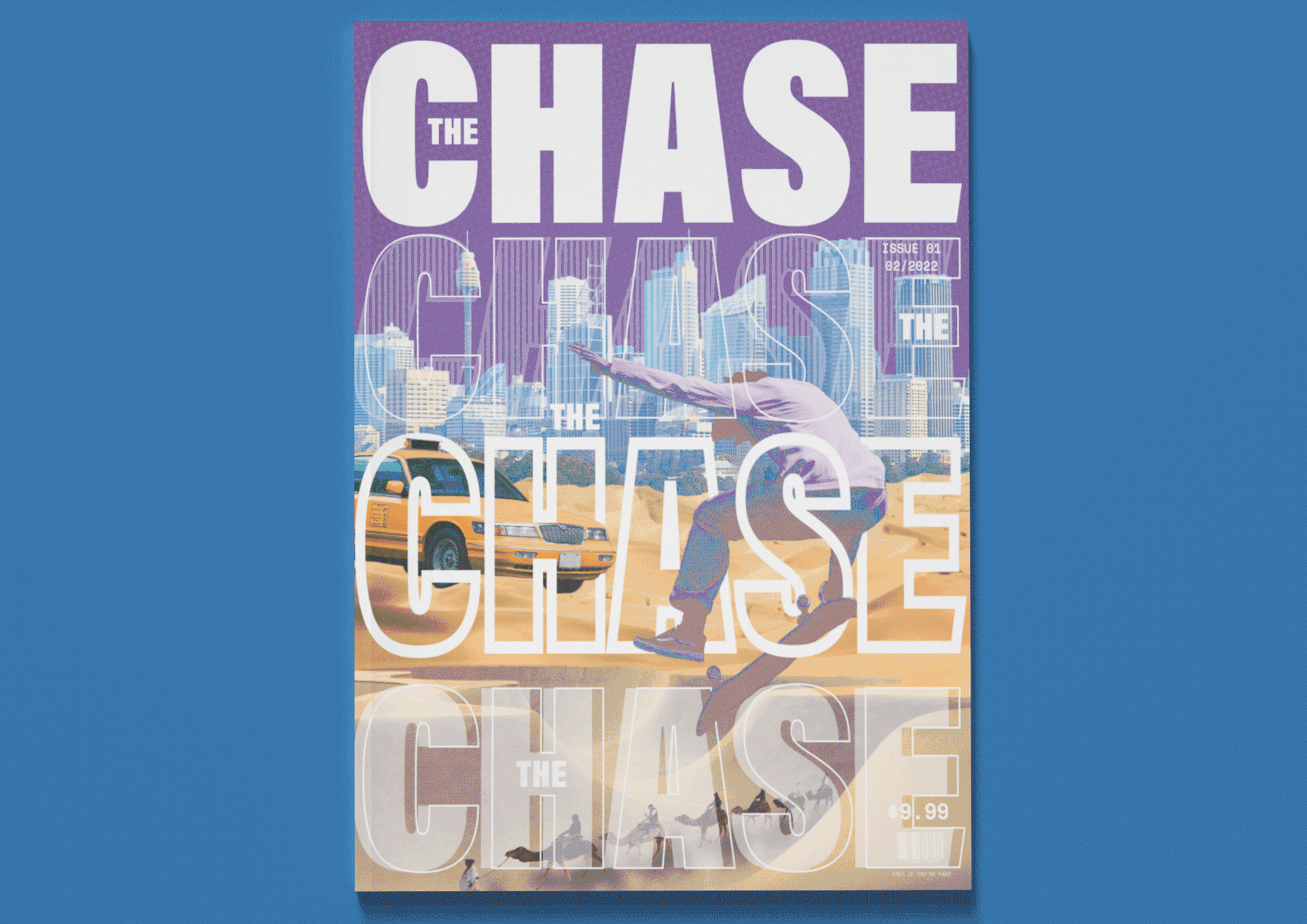
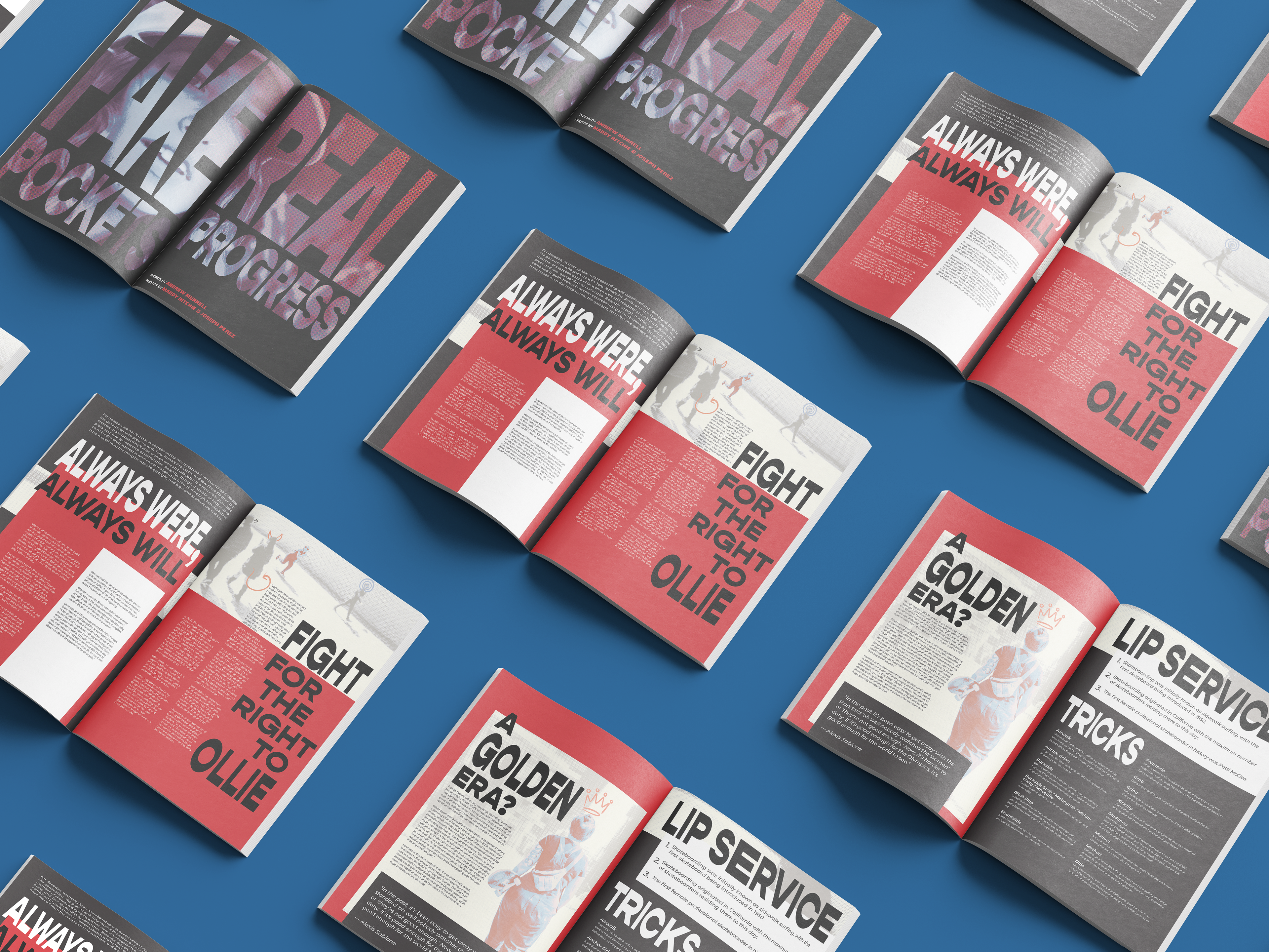
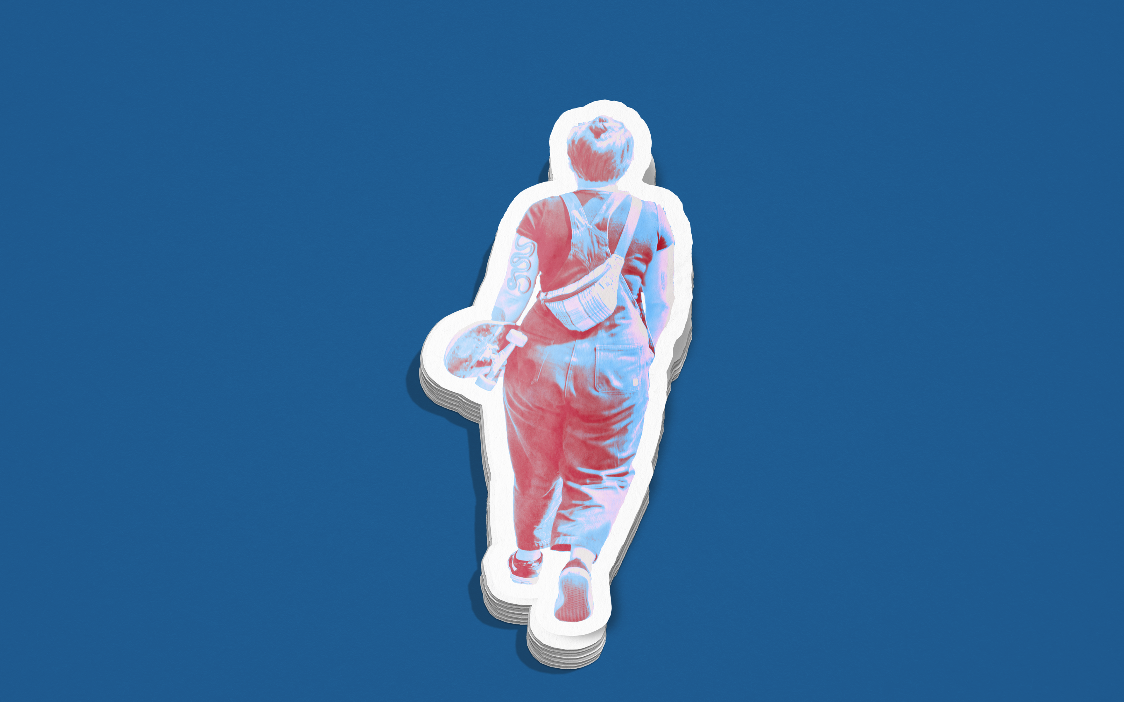
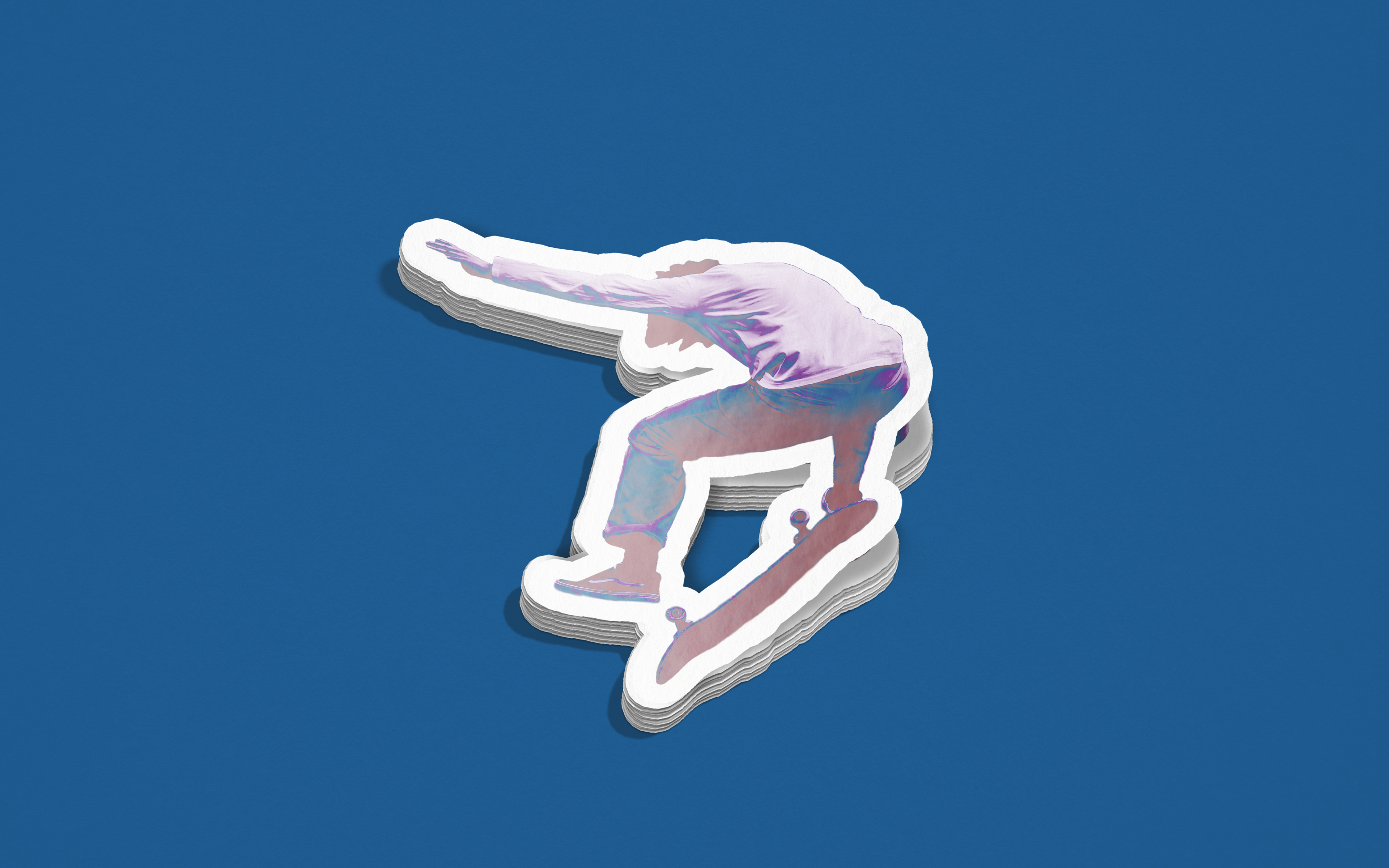
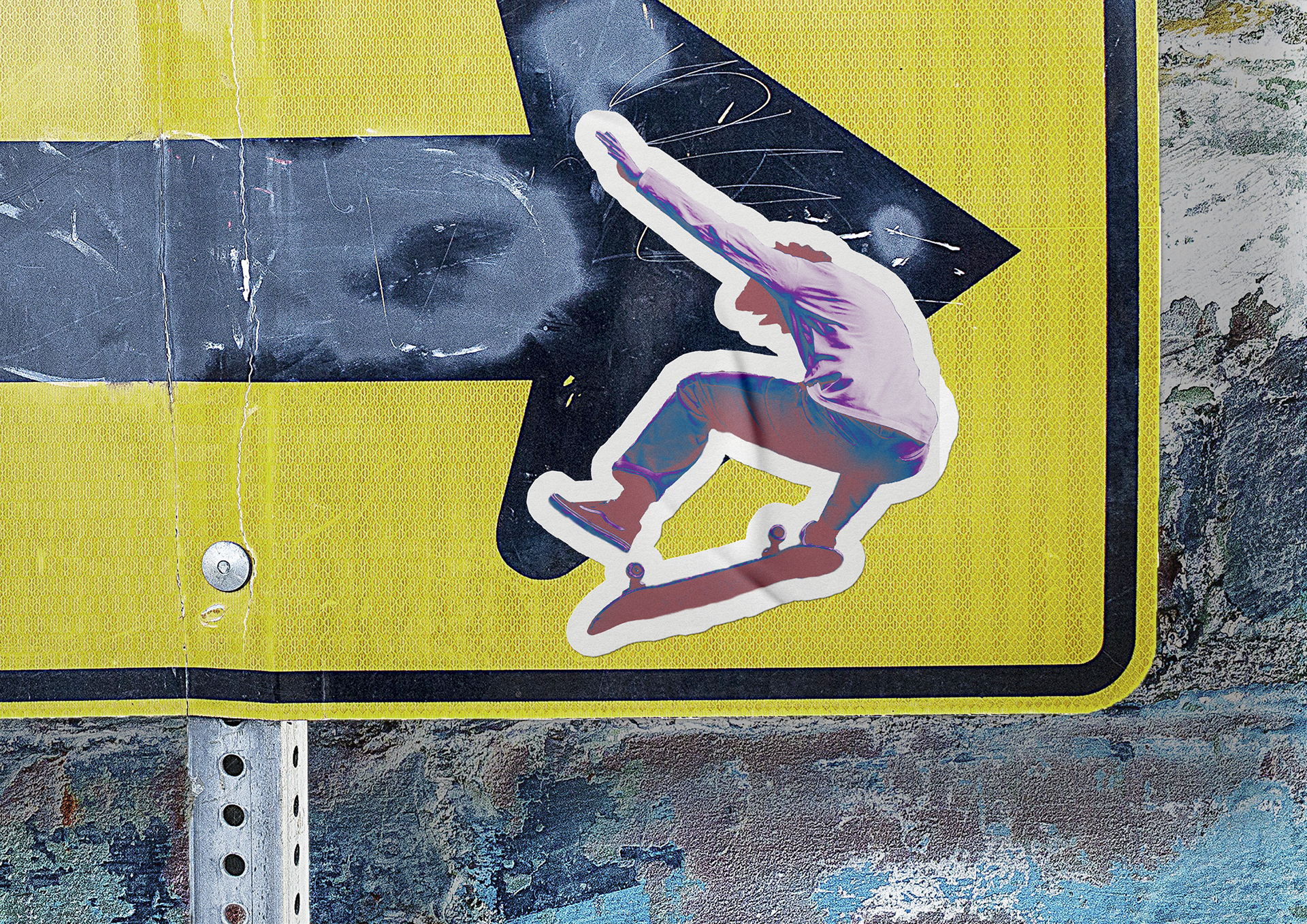
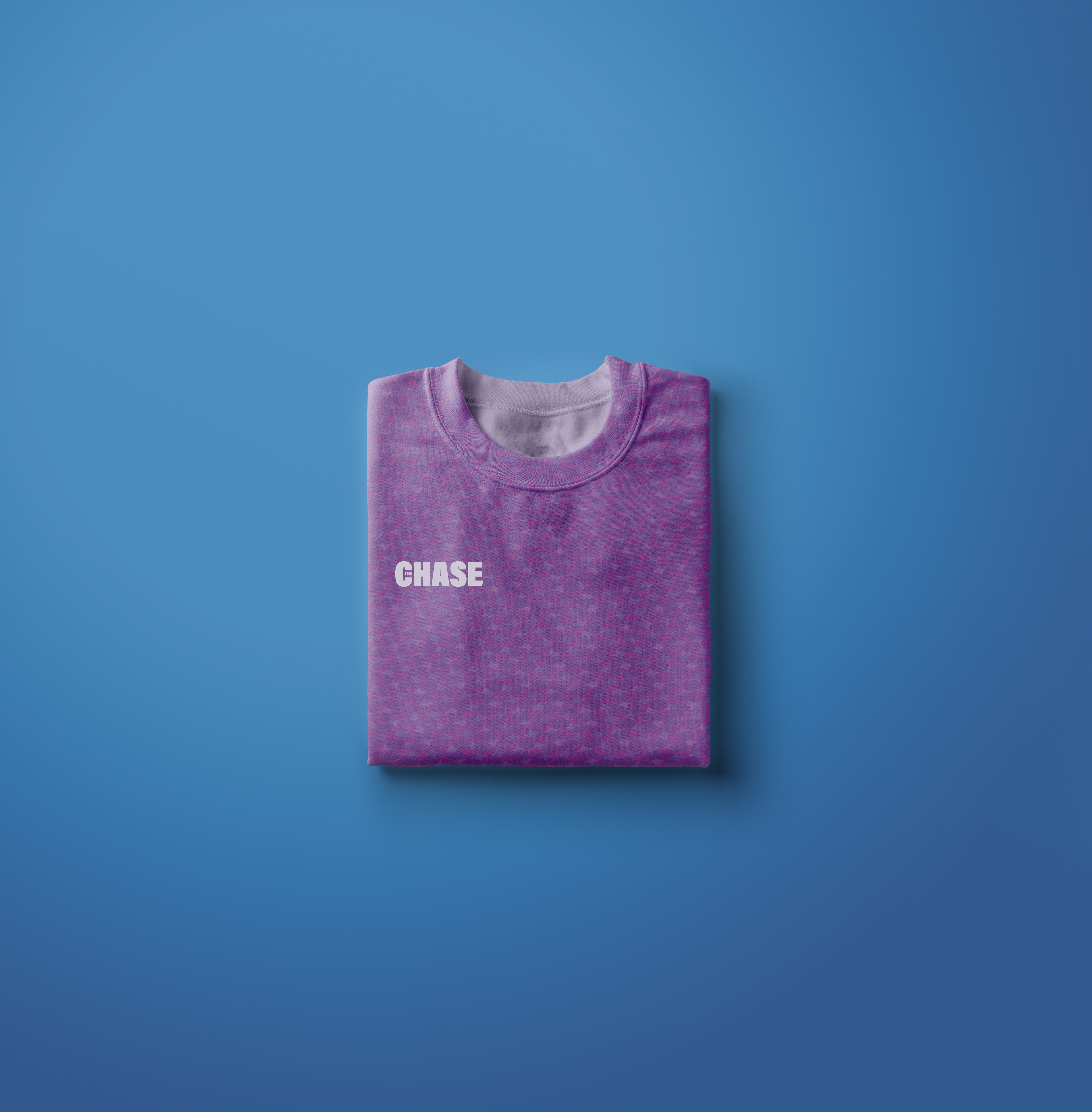
The Chase is an extreme sports zine from Australia, conceived as a sister publication to the already established, surf-centric zine STAB which aims to extend its' reach beyond surfing into a wider cross-section of the extreme sports world.
The Challenge: create a cover page and inside spread for a niche publication's premier issue.
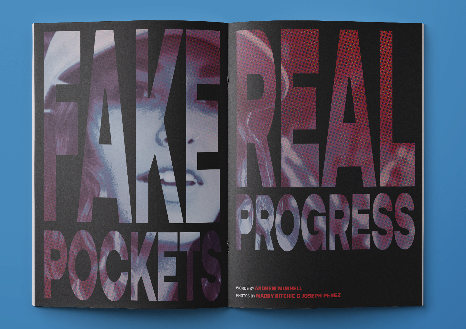
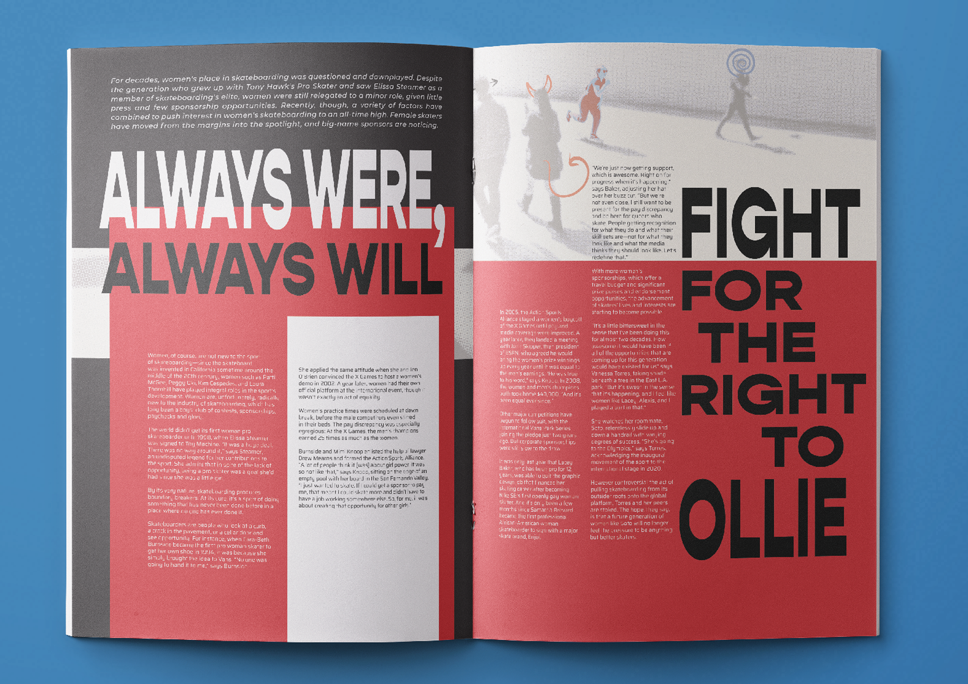
The Q: how can we ideate, design, and produce a cover and article spread for a new zine that aims to tell authentic stories about people in the extreme sports community and focuses on creating an emotional connection to its’ audience?
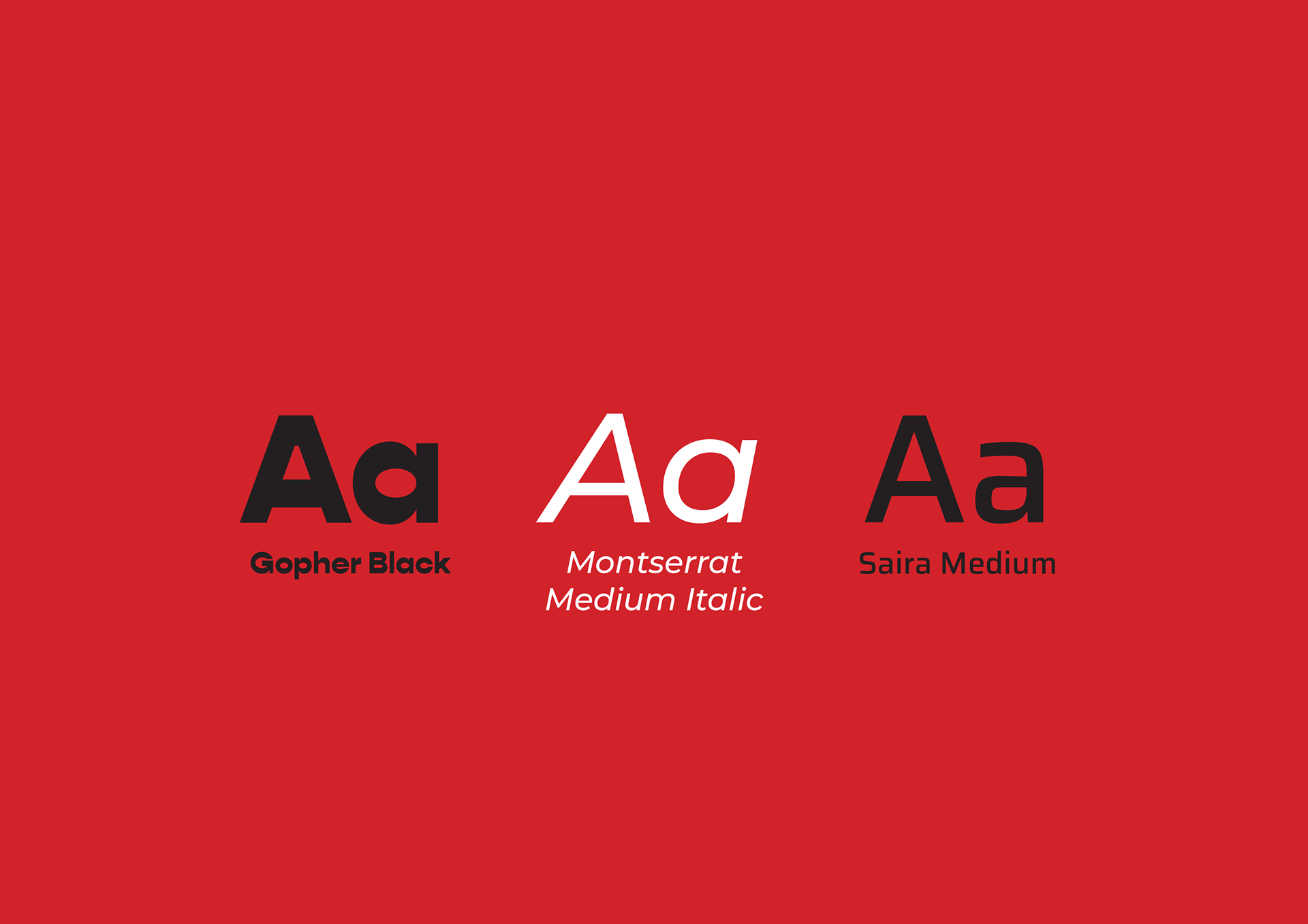
The A: the name The Chase evokes the active process of thrill-seeking that all extreme sports enthusiasts know and love. A bold, rich colour palette alongside a strong mono typeface act as a beacon to those who resonate with an in-your-face aesthetic. At the same time, the gritty, subversive and kinetic layout instantly calls to mind the rough and unpolished world of extreme sports.
Skills: ideation, mood boarding, colour theory, typography, layout, print design, copyediting, inDesign, Photoshop, Illustrator
*this work was produced as a student project for the Shillington School of Graphic Design.